

 |
| Fig. 1 |
 |
| Fig. 2 |
Bureau Mirko Borsche recently did the branding for The Design Museum in Munich, Germany. Their branding identity is based on a basic flag concept where both the German and English translation are presented horizontally and vertically. As a single piece, the flag as a concept is relatively weak in terms of justifying why the typography is set that way. However, when placed horizontally side by side (Fig. 1), the type's composition works together to create a banner that directs the eye across the poster, allowing for easy readability. In Fig. 2, the vertical composition is reflective of architectural structures and relates visually to the exhibition posters next to it. As stated in the essay, ugly design takes on a more conceptual approach to design. Focusing on how type can recreate imagery through its composition.
Another interesting design choice is the personification of the designers through type. This relates to the frequent manipulation of type ugly designers incorporate into their solutions. Representing type through pictorial and expressive means. An aspect 'good' designers don't agree with. As stated by Bureau Borsche, the "custom-made typefaces that aim to emulate the core ideas of the designers’ work without the need to show imagery." Therefore there is a clear intention of Borsche to recreate type through pictorial means.
This pictorial representation is also seen on their other work, for example their bounce campaign for Nike.

The type is manipulated to explicitly communicate the bounce aspect of the campaign. Therefore it can be side that one of ugly design's more recognisable trait is manipulating type to explicitly communicate an idea.
The visual identity for Germany's Design Museum is a stark contrast to the identity developed for the Design Museum in London.


Fernando Gutiérrez opted for a clean and highly legible approach to the museum's branding, leaving little of the designers creativity in its visual. By doing so it allows for the branding to be "timeless and can fit in with all types of aesthetics". It seems the lack of creative personality in the museums branding has allowed it to become a flexible mark because its objectivity acts almost like a blank canvas for which the museum can manipulate their own needs.
Therefore despite Bureau Borsche's unconventional yet exciting solution, the overall visual identity restricts the longevity of the brand. The museum is restricted to this identity that has a fixed way of composing its design. Furthermore what it also highlights is whether the solution will be relevant 5/10 years in the future.


Atlas by Design's identity for the Barcelona design museum also contrasts Bureau Borsche's solution. The identity is clearly structured by a grid that dictates and standardises the informational hierarchy with an impactful use of a sans serif that is remindful of the modernist aesthetic. However what is similar is that the line motif that runs throughout the branding is based around a concept. The line represents a "connecting line" that connects the studio to the rest of Barcelona on the lone diagonal street in the city. However what differs is that the concept is not translated into the typography. The type used is functional without any expressive connotations.

Stedelijk Museum Amsterdam logo can fall under ugly design according to Lazlo Moholy-Nagy. He states that "Legibility - communication must never be impaired by an priori aesthetics. Letters may never be forced into a preconceived framework, for instance a square." Therefore, through this quote the legibility of the museum's mark is compromised because it has been forced through a preconceived framework, i.e. an 'S'. As a result it can be seen as 'ugly' design. However the clean sans serif does retain an adequate enough legibility that allows for the reader to still comprehend the message. The form of each letterform is not altered, only it has been forced into a shape. This does not go to the extent of manipulation seen on more common ugly designs.

The Reykjavik Art Museum is the dominant art museum in Iceland. It operates over three locations: a Contemporary Art museum in Hafnarhús, a Modern Art Museum in Kjarvalsstadir and a sculpture museum dedicated to Ásmundur Sveinsson in Ásmundarsafn.
Stedelijk Museum Amsterdam logo can fall under ugly design according to Lazlo Moholy-Nagy. He states that "Legibility - communication must never be impaired by an priori aesthetics. Letters may never be forced into a preconceived framework, for instance a square." Therefore, through this quote the legibility of the museum's mark is compromised because it has been forced through a preconceived framework, i.e. an 'S'. As a result it can be seen as 'ugly' design. However the clean sans serif does retain an adequate enough legibility that allows for the reader to still comprehend the message. The form of each letterform is not altered, only it has been forced into a shape. This does not go to the extent of manipulation seen on more common ugly designs.
The Reykjavik Art Museum is the dominant art museum in Iceland. It operates over three locations: a Contemporary Art museum in Hafnarhús, a Modern Art Museum in Kjarvalsstadir and a sculpture museum dedicated to Ásmundur Sveinsson in Ásmundarsafn.

This is similar to the way a number of galleries/museums are under the Yorkshire Sculpture Triangle. With the Reykjavik Art Museum rebrand, design studio karlssonwilker aimed to unite the institutions under one symbol, with coincidentally is a triangle.
The triangle is a representation of each museum's position relative to one another from an elevated view. Each museum was too distinct in character to communicate that they are representative of one institution. By uniting them under one symbol, the public have a better understanding of how the art gallery operates, which was a problem as "interviews revealed that the majority did not know the three houses were in fact one museum, one destination." the studio explains.
The simple design solutions and moving prism create a blank canvas for the museum to "express what they want to become".
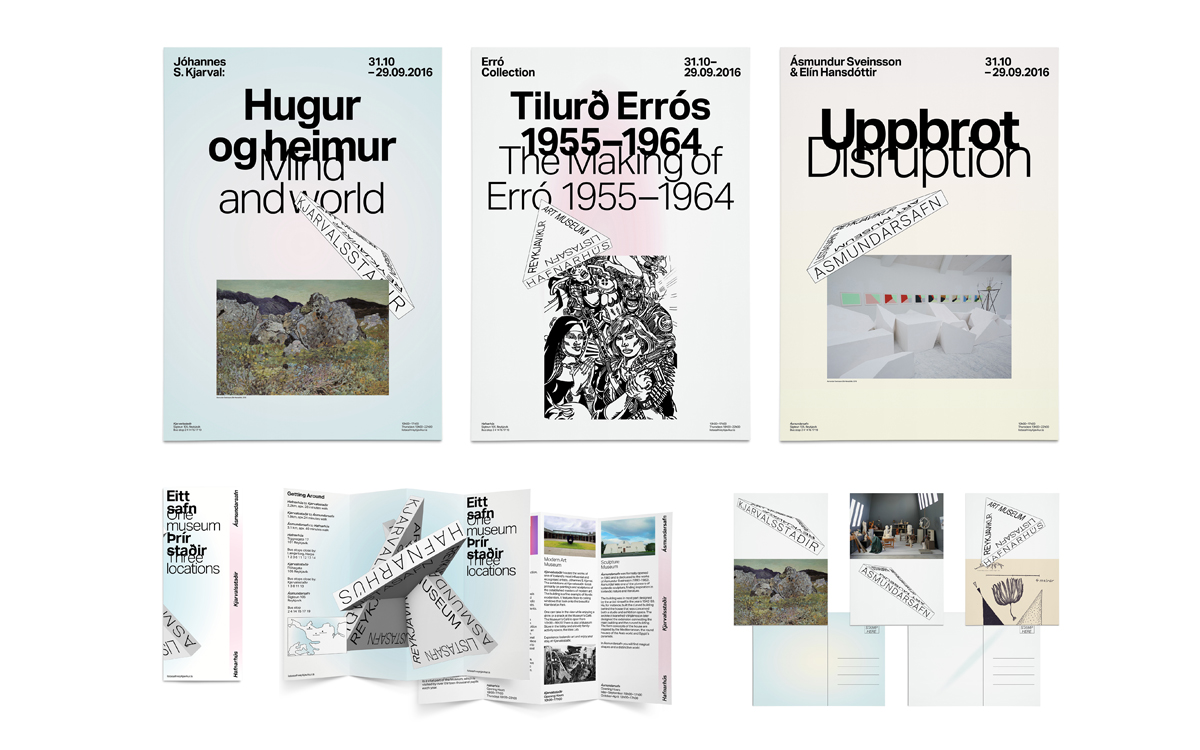
The choice to overlap the text is aimed to convey the idea of connecting the Icelandic and English language. This has been informed by the influx of tourism to Iceland, with many of the tourists speaking English. By doing so, the museum achieves its aim of starting "a dialogue between international and local visitors."
Again this is an example of how an identity is based on simple ideas being expressively and literally conveyed through ugly design. This can be used as a guide to help create the identity for Leeds Art Gallery.
 |
| Fig. 1 |
 |
| Fig. 2 |
 |
| Fig. 3 |
Studio Laucke Sieben is a design studio based in Amsterdam and Berlin. For several years, they have designed almost all of the invitations to exhibitions at the Berlin gallery Scheibler Mitte.
The gallery is in an industrial complex in the 'Mitte' district of Berlin, with the cautionary sign 'Maximum Headroom 3.60m' being a main inspiration for the identity above. The diagonal lines mimic those signs, varying in how extreme the visual is taken. As a result the art direction has impacted the legibility of these invites, especially in Fig. 1.
These invites are representative of an expressive form of design, taking one single idea and stretching its interpretations. The end result is a visually varied and engaging identity that is unified under one common theme that is relevant to the area of the gallery. After looking at these examples of 'ugly' museum branding, the common design approaches are as follows:
These qualities work together to form impressionable and distinguishable identities for the institutions that impart the museum's personality onto the user. Through ugly design, the expressive and subjective qualities create a personality more so than communicate what the museum wants to say. In modernist terms, graphic design should be free from individual personality. However it is this personality that helps the museums stand out from the competitions and at the same communicate who they are as an institution.
No comments:
Post a Comment