Ideas
Idea 01
The incorporation of Yorkshire Sculpture Triangle symbol into the branding.
Rationale


To help unify the different museums within the triangle.
To possibly create a typographic solution that has triangular forms.
Can be experimental in how the triangle is presented in relation to type and imagery.
The use of the yellow triangle and an outlined variation.
Initial sketches:

Idea 02
To have the sculptural forms of Henry Moore and Barbara Hepworth form the identity.
Rationale
Yorkshire’s art scene is famous for its internationally recognised sculptures.
The chosen typeface can be ‘sculpted’ onto the page. Taking on more fluid and expressive forms.
Contemporary use of typography could be overlaid over sculptural shapes.
Incorporating more of green of the existing branding into the identity to relate to the layer of patina on the sculptures.
Idea 03
To use the contrast of old and new of the old Victorian building and the contemporary artwork.
Rationale
From the street, the art gallery is recognisable from its Victorian architecture, whilst inside it boasts a wide range of contemporary sculpture and paintings.
The contrast of old on the outside and new on the inside can be explored.

Idea 04

Idea 05
To explore how Yorkshire museums use space.
Rationale
The ‘Art’ in Leeds Art Gallery to be outlined instead of a fill stroke.
Allows the gallery to fill the ‘space’ inside the typeface in the same way they fill their museum with contemporary artwork.
This can be extended to the visitors. They can fill in the logo with their own interpretations.

Idea 06
Using the gallery’s stone facade and tiled cafe interior as a motif.
Rationale
From the street, the gallery is recognisable through its stone clad exterior, providing a neutral shade against the green colour scheme.
The tiled interior of the cafe is on the gallery’s unique features that could be a way incorporate into the identity.
Idea 07
To build upon the gallery’s use of their green.
Rationale
The current usage is arbitrary with the green not effectively becoming a recognisable colour for the gallery. The rebrand would apply more creative uses of the colour to help associate the gallery.

To celebrate both the historic architecture and supporting contemporary art.
Initial sketches:

Idea 04
A typographic solution based on the gallery’s Victorian roof.
Rationale


Rationale


The gallery is currently renovating the roof until October 2017.
As seen from a bird’s eye perspective, the roof’s arrangement an be seen as a grid to form letterforms for the gallery’s logo.
Further using it as a branding element in the same way other museums use the buildings architecture as their brand identity.
Initial sketches:
As seen from a bird’s eye perspective, the roof’s arrangement an be seen as a grid to form letterforms for the gallery’s logo.
Further using it as a branding element in the same way other museums use the buildings architecture as their brand identity.
Initial sketches:

Idea 05
To explore how Yorkshire museums use space.
Rationale
The ‘Art’ in Leeds Art Gallery to be outlined instead of a fill stroke.
Allows the gallery to fill the ‘space’ inside the typeface in the same way they fill their museum with contemporary artwork.
This can be extended to the visitors. They can fill in the logo with their own interpretations.
Initial sketches:

Idea 06
Using the gallery’s stone facade and tiled cafe interior as a motif.
Rationale
From the street, the gallery is recognisable through its stone clad exterior, providing a neutral shade against the green colour scheme.
The tiled interior of the cafe is on the gallery’s unique features that could be a way incorporate into the identity.
Idea 07
To build upon the gallery’s use of their green.
Rationale
The current usage is arbitrary with the green not effectively becoming a recognisable colour for the gallery. The rebrand would apply more creative uses of the colour to help associate the gallery.
Idea 08
Explicit forms of right angles to associate the straightedged and solid architecture of the gallery as well as incorporating the right angle form of a staircase.
Rationale
The gallery is built using stone blocks that create a rigid architectural form, limiting curvature seen in its facade. The entirety of its facade is made from straight lines.
 |
| Town Hall steps |
 |
| Parkinson steps |
 |
| Leeds Art Gallery steps |
A very obscure relation between the historical and cultural landmarks in Leeds is the steps that lead up to it. Often ignored these steps are what guide the visitors and act as a visual identifier for the buildings entrance. Steps are also made up of right angles, which relate to the buildings straight forms.
This idea is unconventional yet appropriate given the nature of ugly design. Unconventional approaches to simple design ideas was an aspect discussed in the essay and this idea would be good opportunity to demonstrate this.
Initial sketches:

Considerations
Colour


The gallery's current shade of green is far too flat and corporate to get people excited about visiting. An effective visual identity will align itself with the audience's perceived self image as it allows the audience to relate themselves to the brand and therefore more likely to visit the gallery.
Image

An ugly design characteristic that can be used within the branding is through having exposed content on the gallery's collateral. By having the exposed content, it directly communicates the gallery's content onto the audience. This can help generate interest and better inform those who are unfamiliar with the gallery or the art world itself.
Typography
The branding must demonstrate an unconventional use of typography in its identity. This was a frequently discussed topic in the essay and was a key factor in splitting designers opinion.
The use of type should not be purely functional as well. As seen in the examples by Bureau Mirko Borsche, type can have a symbolic and aesthetic function as well in communicating the identity's idea. Through this, the clarity and simplicity of type will be compromised, thus leading to ugly design.
The gallery's current use of typography is arbitrary which does not create a distinctively unique identity for the gallery.
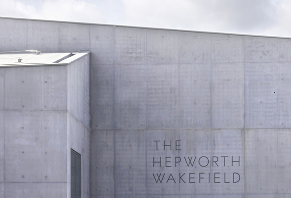
As compared to the Hepworth Wakefield, the quiet and restrained use of type communicates a professional and serious identity for the gallery that reflects the art curation and its history. What is successful about the identity is that it makes the gallery look reputable despite it being designed in 2011. A professional identity will communicate a brand that is worth investing time into, and in this case attracting more gallery visitors, which in turn will help attract more internationally renowned artists.
Principles
These are some of the principles that should be avoided/followed when designing the gallery's identity.
The identity should avoid adhering to the principles of good design
"Modernism is the antithesis to ugly design and was the only way for attaining ‘good’ design for its designers. Ugly design is based on subjective views to design problems which result in the recurring practice of representing typography through more pictorial and artistic means."
The identity should follow trends
A point discussed in the essay, ugly design is considered to be a trend by modernist designers that deems its an unsuccessful form of design. "Modernist-influenced designers refer the trend as a step backward to what design is supposed to be. Communication of the idea and legibility of the message have been put to the wayside for more creative and expressive representations by these new designers."
However what characterised post modernism and ugly design against modernism is the frequent criticism of them being trends rather than a valid alternate approach to design. Ugly designers incorporate their own personal cultural influences and have been taught a different approach to design by institutions that facilitate a more creative and experimental thought process. Their work is more reflective of the cultural period they are designing in rather than designing with the aim to serve society as long as possible.
The identity should demonstrate a manipulation of type
Manipulation of type is used expressively in ugly design to communicate conceptual ideas, which in turn stresses more so on the superficial quality of the work rather than its function. However this compromises the legibility and communication of the message which according to Modernism is not good design.
Legibility is not the paramount aim
Modernism considers legibility to be a crucial aim in design. This allows the designer to communicate the intended message efficiently to the audience, reducing confusion and bad design. "Superficial design, or in some instances ugly design, creates its own downfall. The lack of legibility reduces the purpose of typography delivering its message. By eliminating this purpose, the point of its design has failed."
An identity that is reflective of the current state of graphic design
As explained above and in the essay, ugly design can be seen as a representation of the cultural period of which it is designed in. Modernism sought to eliminate this and create design that was modern in any period.
The new proposed identity for Leeds Art Gallery should be reflective of design trends today which will relate to the gallery's effort in curating acclaimed contemporary art.
Audience
The proposed identity will be aimed towards the younger audience in Leeds, namely the18-30 year olds that predominantly make up the city's population. This is due to the number of higher educational institutions within the city, the emerging business district near the canals and the conscious effort to provide a sophisticated shopping experience what with the recent John Lewis building. Leeds has become an attractive city for this demographic.
The current branding for Leeds Art Gallery does not align itself with the energy and vibrancy of this demographic.
User experience
The users experience during a visit to the gallery will be influenced by its identity. It will influence how the user navigates the space inside, get to know of current and future exhibitions, finding the gallery from street level and their own perception of the gallery. The gallery's identity should be contemporary and professional to provide a encouraging space for artists to showcase their work yet appeal to the young audience in Leeds.
Usability
In terms of the gallery, usability will be determined based on how long the proposed identity will last and how usable it is across the various formats. The gallery should not be redesigning its identity every 10 years because of how much of a trend the current one is.
No comments:
Post a Comment